
Picador
Picador is the literary imprint at Pan Macmillan and what defines a Picador book is the author’s voice: we believe the way a story is told is just as important as the story itself. We publish writers from all over the world, bringing international authors to an English-language readership and providing a platform for voices that are often not heard. The Picador list includes literary fiction; new, relevant and challenging fiction; narrative non-fiction; authoritative, cultural non-fiction; and the best contemporary poetry, as well as a number of uncategorizable books that will, we hope, surprise you.
We are lucky to be home to prize-winning, internationally renowned writers and we are the proud publisher of many bestselling titles.
We also aim to make beautiful books, with the highest production and design values, from exciting and original first publications to clean, elegantly commercial paperbacks, alongside digital and audio editions.
Books
Just About Coping
Natalie Cawley
Storm Pegs
Jen Hadfield
Anyone's Ghost
August Thompson
Rosarita
Anita Desai
The Endless Country
Sami Kent
Bonding
Mariel Franklin
How Was It for You?
Eve Smith
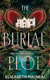
The Burial Plot
Elizabeth Macneal
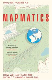
Mapmatics
Paulina Rowinska
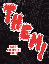
Them!
Harry Josephine Giles

Everyone Who Is Gone Is Here
Jonathan Blitzer
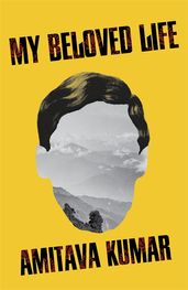
My Beloved Life
Amitava Kumar
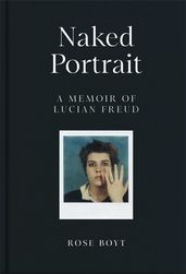
Naked Portrait: A Memoir of Lucian Freud
Rose Boyt
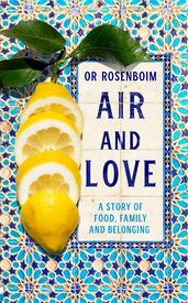
Air and Love
Or Rosenboim
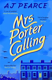
Mrs Porter Calling
AJ Pearce
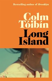
Long Island
Colm Tóibín
Mothers and Sons
Colm Tóibín
The Last Drop
Tim Smedley
Party Lines
Ed Gillett

Before We Say Goodbye
Toshikazu Kawaguchi
The Places In Between
Rory Stewart
Occupational Hazards
Rory Stewart
The Garden Against Time
Olivia Laing
The Wonder
Emma Donoghue